Types of Components
Components are user interface elements that can be used in different places, such as items, and layers.
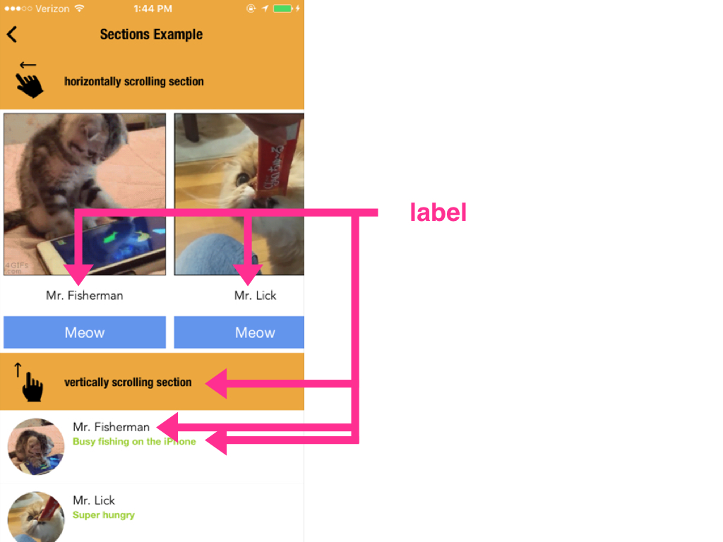
- label
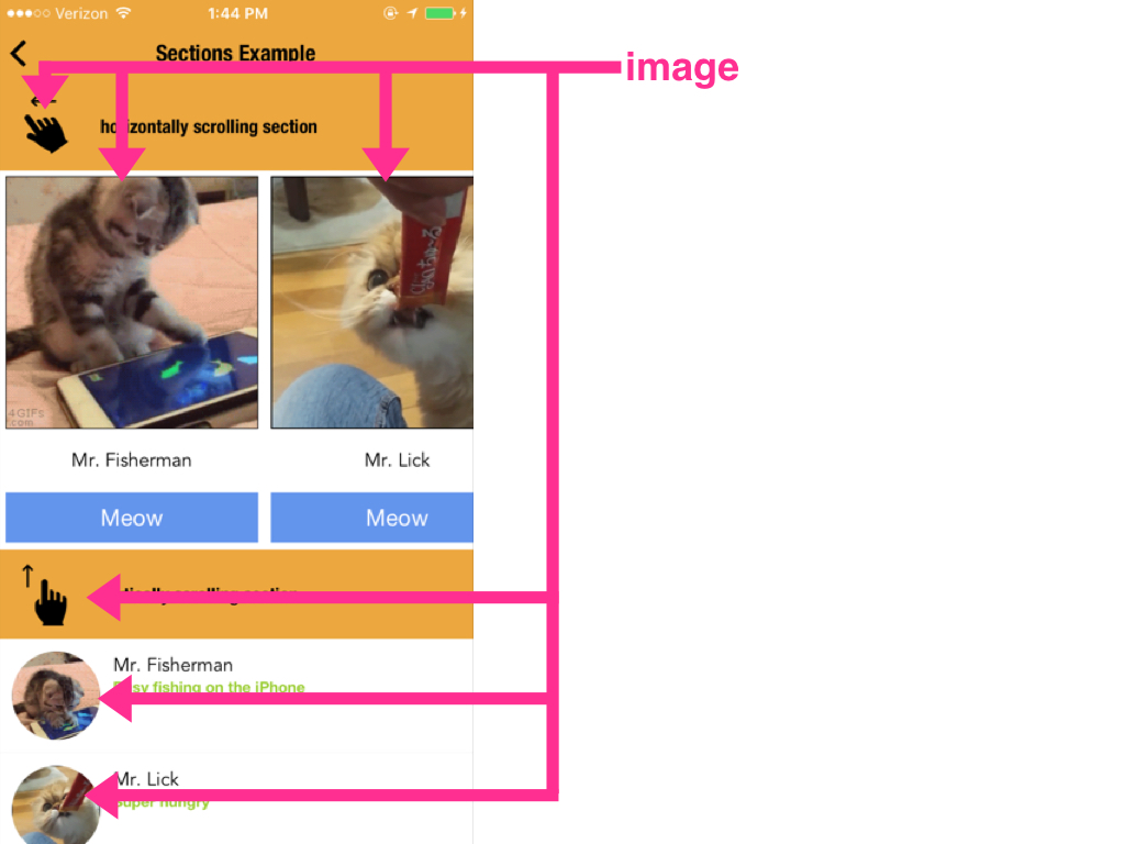
- image
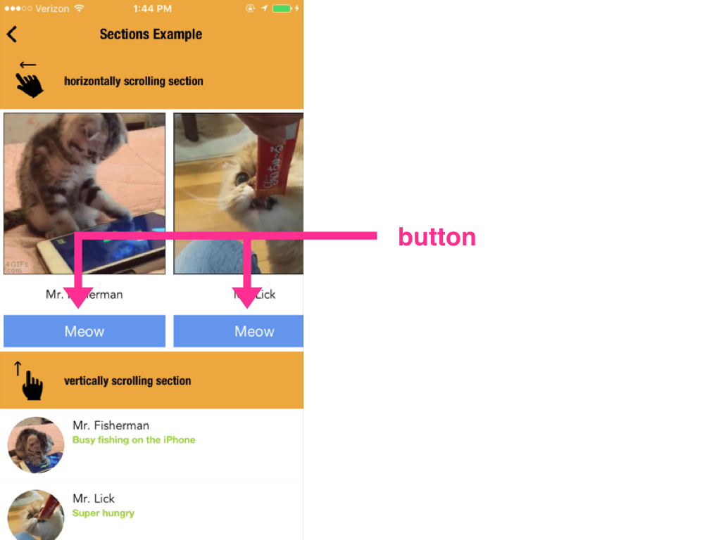
- button
- textfield
- textarea
- slider
- switch
- html
- space
- map
- Don't see what you want? You can add more!
■ label
Static uneditable text element.
syntax
type:"label"text: The text to displaystyle:font: text font namesize: text sizecolor: text color in color codepadding: padding in pixelsbackground: background color of the label in color codecorner_radius: corner radius for the label
example
{
  "type": "label",
  "text": "Hello world",
  "style": {
    "font": "Avenir",
    "size": "30",
    "color": "rgb(200,0,0)",
    "padding": "10"
  }
}
■ image
Image loaded from either remote url or data-url
⚠️ Disclaimer:
image components are NOT Interactive. To attach
actionorhrefto make an image interactive, use image buttons
syntax
type:"image"url: image urlheader: (optional) in case the image needs authentication and we need to attach a header object to the requeststyle(optional)corner_radius: corner radius. use this to make the image roundedwidthheightcolor: To set the tint color (only for icons)
example
{
  "type": "image",
  "url": "http://i.imgur.com/KUJPgGV.png",
  "header": {
    "auth_token": "3nfdss3fNdlenghs_dnekgldnvq334hd"
  },
  "style": {
    "width": "50",
    "height": "50",
    "corner_radius": "25"
  }
}
■ button
A basic component that responds to user tap.
Can be either a text button or an image button, depending on what attributes are used.
syntax
type:"button"text: button text (pick eithertextorurl, can't have both)url: button image url (pick eithertextorurl, can't have both)header: (optional) in case the we're using the image button and the image needs authentication and we need to attach a header object to the requeststylewidth: Width of the clickable region (In case of image buttons, the image will auto-resize proportionally to fit into this region)height: Height of the clickable region (In case of image buttons, the image will auto-resize proportionally to fit into this region)color: text colorbackground: background colorborder_width: border width for the buttonborder_color: border color for the buttoncolor: To set the tint color (only for icons)corner_radius: corner radius for the buttonpadding: padding outside of the text (in case of text button) or outside of the image (in case of image button). Note that the height and width will stay the same regardless of what padding value you set.align: Only for text buttons. You can set it asleft,right, orcenter. The default iscenter. (Irrelevant on image buttons since image buttons will always be centered)
- action : Attach an action attribute to be triggered when user taps the button.
Example
Text button
Use text attribute to make it a label button
{
  "type": "button",
  "text": "Tap Me!",
  "style": {
    "width": "50",
    "height": "50",
    "background": "#00ff00",
    "color": "#ffffff",
    "font": "HelveticaNeue",
    "size": "12",
    "corner_radius": "25"
  },
  "action": {
    "trigger": "reload"
  }
}
Image button
Use url attribute to make it an image button
{
  "type": "button",
  "url": "https://raw.githubusercontent.com/Jasonette/Jasonpedia/gh-pages/assets/krusty.png",
  "header": {
    "auth_token": "3nfdss3fNdlenghs_dnekgldnvq334hd"
  },
  "style": {
    "width": "50",
    "height": "50",
    "background": "#00ff00",
    "color": "#ffffff",
    "font": "HelveticaNeue",
    "size": "12",
    "corner_radius": "25"
  },
  "action": {
    "trigger": "reload"
  }
}
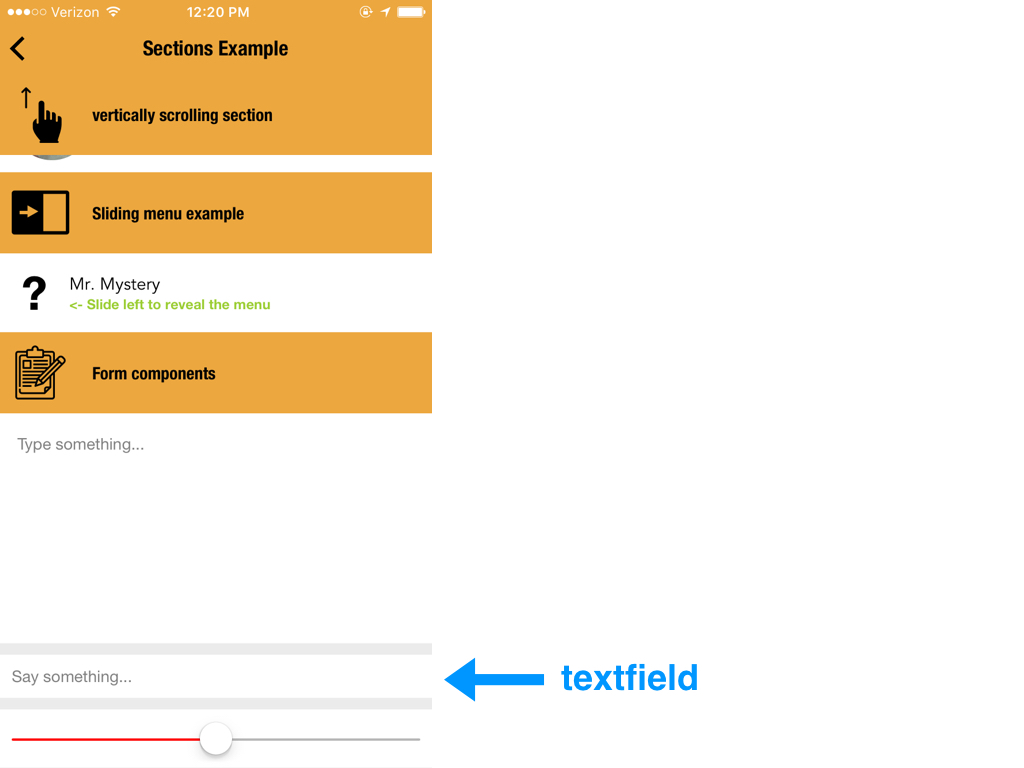
■ textfield
Single line input field
textfields are seamlessly integrated with local variables
syntax
name: name of the local variable to set.value: in case you wish to prefill the field.placeholder: Placeholder text for when there's no content filled in.keyboard: The keyboard type. One of the following:"text"|"number"|"phone"|"decimal"|"url"|"email"(if unspecified, the default is"text")focus: Set"true"to autofocus this component on view load.style: style the textfieldbackgroundalignautocorrect: set to"true"to enable autocorrectautocapitalize: set to"true"to enable autocapitalizespellcheck: set to"true"to enable spellchecksize: text sizefont: text fontcolor: text colorplaceholder_color: placeholder text colorsecure:hide character input if set to"true"
examples
Example 1: password input
{
  "type": "textfield",
  "name": "password",
  "value": "dhenf93f!",
  "placeholder": "Enter password",
  "style": {
    "placeholder_color": "#cecece",
    "font": "HelveticaNeue",
    "align": "center",
    "width": "200",
    "height": "60",
    "secure": "true",
    "size": "12"
  }
}
Example 2: autocorrect/autocaptiazlie/spellcheck input
{
  "type": "textfield",
  "name": "status",
  "placeholder": "Status update",
  "style": {
    "placeholder_color": "#cecece",
    "font": "HelveticaNeue",
    "align": "center",
    "width": "200",
    "height": "60",
    "autocorrect": "true",
    "autocapitalize": "true",
    "spellcheck": "true",
    "size": "12"
  }
}
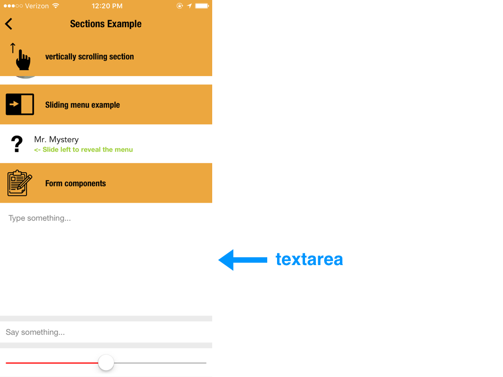
■ textarea
Multiline input field
name: name of the local variable to set.value: in case you wish to prefill the field.placeholder: Placeholder text for when there's no content filled in.keyboard: The keyboard type. One of the following:"text"|"number"|"phone"|"decimal"|"url"|"email"(if unspecified, the default is"text")focus: Set"true"to autofocus this component on view load.style: style the textfieldbackgroundalign:"left"|"center"|"right"(default is"left")autocorrect: set to"true"to enable autocorrectautocapitalize: set to"true"to enable autocapitalizespellcheck: set to"true"to enable spellchecksize: text sizefont: text fontcolor: text colorplaceholder_color: placeholder text color
example
Below, we've named the textarea status, and then refer to its value from submit action through the template expression {{$get.status}}
{
  "$jason": {
    "head": {
      "actions": {
        ...
        "submit": {
          "type": "$network.request",
          "options": {
            "url": "https://stts.jasonclient.org/status.json",
            "method": "post",
            "data": {
              "content": "{{$get.status}}"
            }
          },
          "success": {
            "type": "$reload"
          }
        }
        ...
      }
    },
    "body": {
      ...
      {
        "type": "textarea",
        "name": "status",
        "placeholder": "Status update",
        "value": "Eating lunch..",
        "style": {
          "background": "rgba(0,0,0,0)",
          "placeholder_color": "#cecece",
          "font": "HelveticaNeue",
          "align": "center",
          "width": "100%",
          "height": "300",
          "autocorrect": "true",
          "autocapitalize": "true",
          "spellcheck": "true",
          "size": "12"
        }
      }
      ...
    }
  }
}
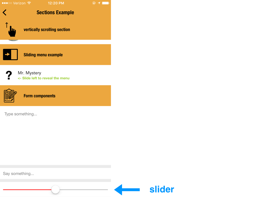
■ slider
Horizontal slider input
syntax
name: name of the local variable to set.value: value between 0 and 1 (in string) to preset the slider with. For example"0.3"action: action to execute after user completes the sliding gesture.stylewidthheightcolor
example
Below, we set the slider's name gauge and triggers the notice action, which accesses its value whenever the user ends the sliding action.
{
  "$jason": {
    "head": {
      ...
      "notice": {
        "type": "$util.alert",
        "options": {
          "title": "Volume changed",
          "description": "{{parseFloat($get.gauge)*100}}%"
        }
      }
      ...
    },
    "body": {
      ...
      {
        "type": "slider",
        "name": "gauge",
        "action": {
          "trigger": "notice"
        }
      }
      ...
    }
  }
}
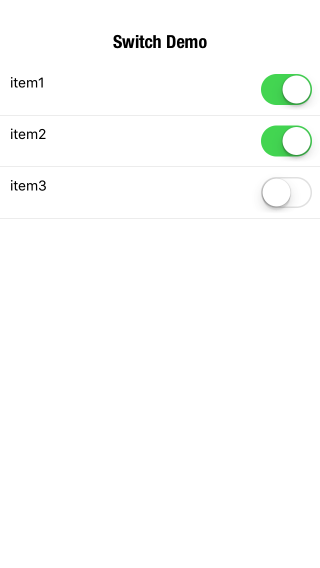
■ switch
Simple true/false input
syntax
name: name of the local variable to set.value: boolean.true(switch to the right).false(switch to the left).action: action to execute after user completes the sliding gesture.stylecolor: "active (right) state color" (default os active state color if not specified).color:disabled: "inactive (left) state color" (default os inactive state color if not specified).
example
Below, we set the switch's name light and triggers the banner action, which accesses its value whenever the user changes the switch position.
{
  "$jason": {
    "head": {
      ...
      "banner": {
        "type": "$util.banner",
          "options": {
            "title": "{{$get[$jason.item].toString()}}",
            "description": "{{$jason.item}}"
          },
          "success": {
            "type": "$render"
          }
        }
      }
      ...
    },
    "body": {
      ...
      {
        "type": "switch",
        "name": "light",
        "value": "true",
        "action": {
          "trigger": "banner",
          "options": {
            "item": "Light is On?"
          }
        }
      }
      ...
    }
  }
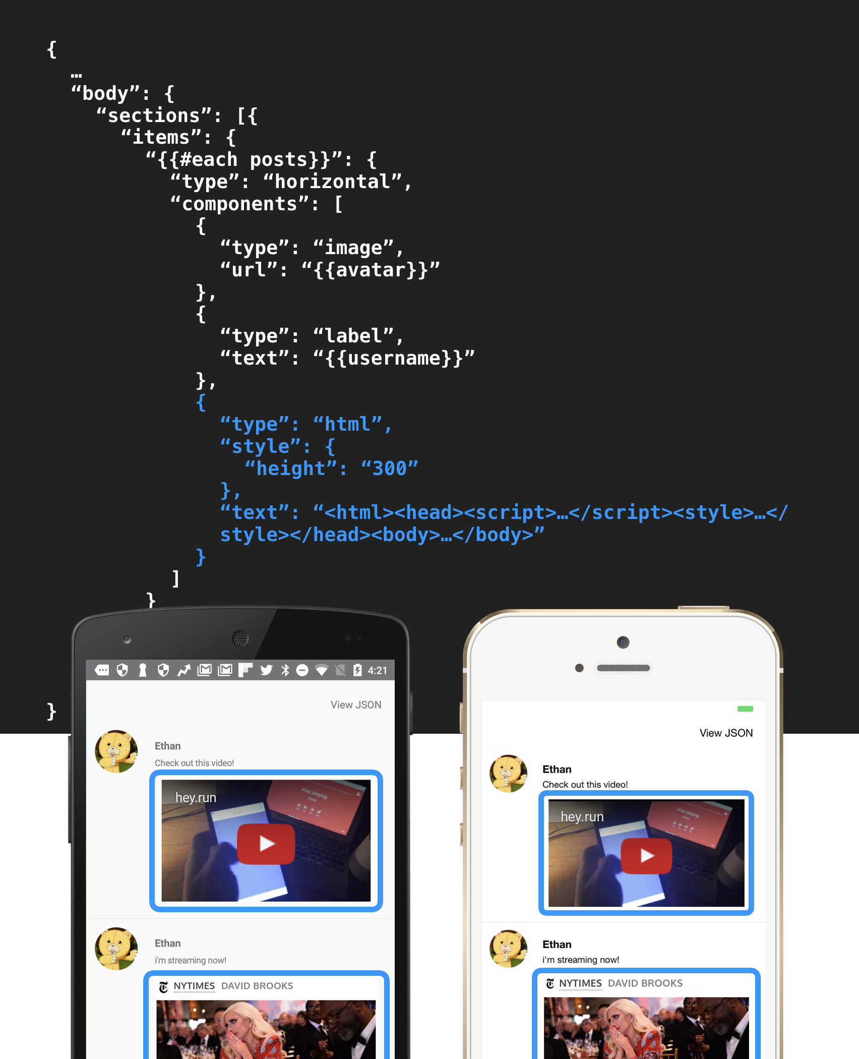
■ html
A self-contained web environment that you can plug in, style, and manipulate just like the rest of the components.
To learn more, refer to Web containers.
■ space
An empty space component mostly used for layout purposes.
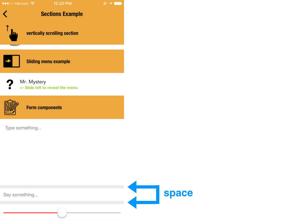
syntax
stylebackground: background color (transparent if not specified)width: only specify if you want a horizontally fixed size spaceheight: only specify if you want a vertically fixed size space
Example 1. Flexible size space
If you don't specify the style, the space component will contract or expand flexibly depending on its surrounding sibling components.
This is useful for when you wish to make special alignments, such as aligning one component to the left, and the other to the right in a horizontal layout.
{
  "type": "horizontal",
  "components": [
    {
      "type": "image",
      "url": "https://jasonclient.org/img/john.png",
      "style": {
        "width": "50"
      }
    },
    {
      "type": "space"
    },
    {
      "type": "button",
      "text": "Follow"
      "style": {
        "width": "100",
        "height": "50"
      }
    }
  ]
}
Example 2. Fixed size space
You can also set the size of a space component.
{
  "type": "vertical",
  "components": [
    {
      "type": "image",
      "url": "https://jasonclient.org/img/john.png",
      "style": {
        "width": "50"
      }
    },
    {
      "type": "space",
      "style": {
        "height": "50"
      }
    },
    {
      "type": "label",
      "text": "The names 'John Doe' or 'John Roe' for men, 'Jane Doe' or 'Jane Roe' for women, or 'Johnnie Doe' and 'Janie Doe' for children, or just 'Doe' non-gender-specifically are used as placeholder names for a party whose true identity is unknown or must be withheld in a legal action, case, or discussion."
    }
  ]
}
■ map
Map component
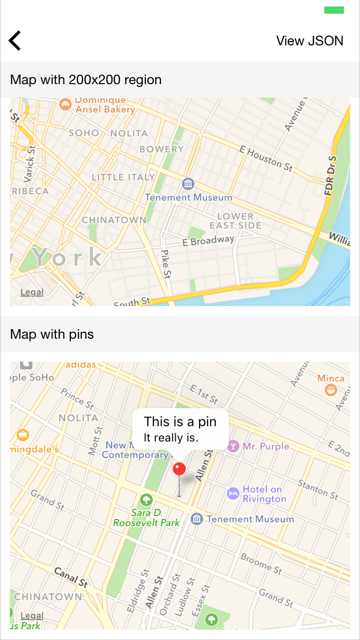
syntax
• type: "map"
• region: Describes the region this map component will draw.
coord: Coordinate string inLATITUDE,LONGITUDEformat, around which the map should be centered. (example:"40.7146598,-73.9418602")width: The width in meters in terms of how wide the map region should beheight: The height in meters in terms of how wide the map region should be
• pins: Array of pin objects. Each pin contains the following attributes:
coord: Coordinate string inLATITUDE,LONGITUDEformat. (example:"40.7146598,-73.9418602")titledescriptionstyleselected: display the annotation by default even when not tapped.
• style: Styling of the component itself
type:"satellite"|"hybrid"|"hybrid_flyover"|"satellite_flyover"width: width of the component to displayheight: height of the component to displaycorner_radius: corner radius of the component
Example
{
  "type": "map",
  "region": {
    "coord": "40.7197614,-73.9909211",
    "width": "100",
    "height": "100"
  },
  "pins": [{
    "title": "This is a pin",
    "description": "It really is.",
    "coord": "40.7197614,-73.9909211",
    "style": {
      "selected": "true"
    }
  }],
  "style": {
    "width": "100%",
    "height": "300"
  }
}
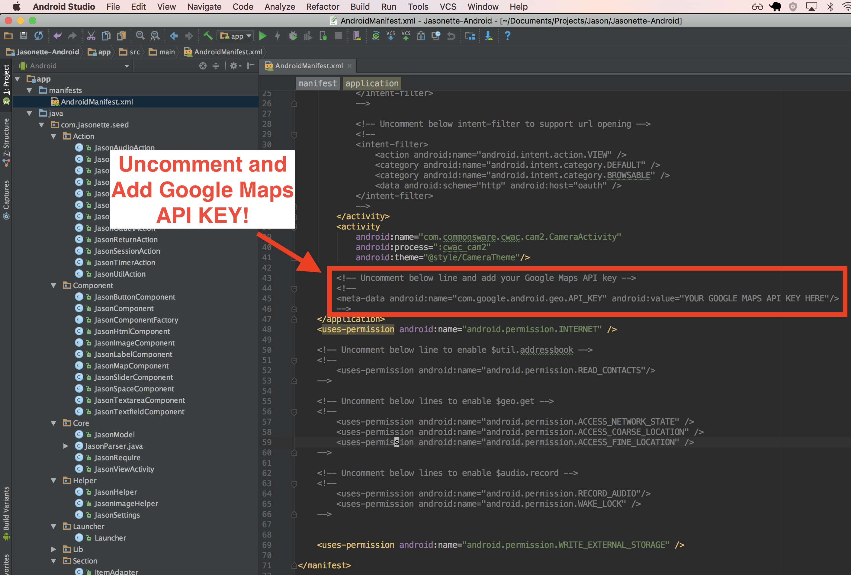
Permissions and API Keys
On iOS the map component works right out of the box using Apple's native map.
However on Android you need to set it up using Google Maps API.
- Just open up
AndroidManifest.xmlfile from Android Studio. - Uncomment the lines described below:
- And add your Google Maps API Key (You can get it from here)